COVID-19 Data Visualization Python Project Class 12
Last updated on December 28th, 2023 at 10:11 am
COVID-19 Data Visualization Python Project Class 12
# Python Project for Class 12 Informatics Practices (065), Python MySQL program containing bar graph, line chart, scatter chart
Note: If you found something wrong or unable to execute the program kindly mention in comment box provided below the article.
#cbsepython.in
import pandas as pd
import numpy as np
import matplotlib.pyplot as plt

def Fun():
    print(":)")
    print("#1. For checking the data.")
    print("#2. Reading complete file without index.")
    print("===================")
    print("Topic - Data Visualization")
    print(" ")
    print("#3. Line Chart")
    print("    Press 1 to print the data for Confirmed cases as per Districts.")
    print("    Press 2 to print the data for Recovered cases as per Districts.")
    print("    Press 3 to print the data for Death cases as per Districts.")
    print("    Press 4 to print the data for Active cases as per Districts.")
    print("    Press 5 to print All data.")
    print(" ")
    print("#4. Bar Graph")
    print("    Press 1 to print the data for Confirmed cases as per Districts.")
    print("    Press 2 to print the data for Recovered cases as per Districts.")
    print("    Press 3 to print the data for Death cases as per Districts.")
    print("    Press 4 to print the data for Active cases as per Districts.")
    print("    Press 5 to print the data in form of stack bar chart")
    print("    Press 6 to print the data in form of multi bar chart")
    print(" ")
    print("#5. Scatter Chart")
    print(" ")
    print("#6. For Exit")
    print("===============")


def Read_CSV():
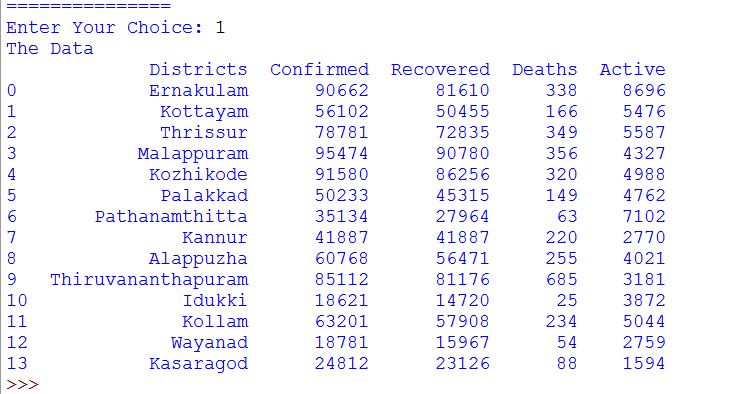
    print("The Data")
    df=pd.read_csv('D:\\Covid_data_kerala.csv')
    print(df)

def No_Index():
    print("Reading the file without index")
    df=pd.read_csv('D:\\Covid_data_kerala.csv', index_col=0)
    print(df)


#FOR LINE CHART:)

def line_plot():
    df=pd.read_csv('D:\\Covid_data_kerala.csv')
    df['Districts'] = ['EKM','PTA','KTM','TSR','KKD','MPM','KLM','PKD','ALP','KNR','TVM','IDK','WYD','KGD']
    District=df["Districts"]
    Confirmed=df["Confirmed"]
    Recovered=df["Recovered"]
    Deaths=df["Deaths"]
    Active=df["Active"]
    plt.xlabel("Districts")


    YC = int(input("Enter the number representing your preferred line chart from the above choices: "))

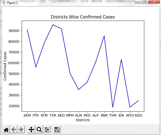
    if YC == 1:
        plt.ylabel("Confirmed Cases")
        plt.title("Districts Wise Confirmed Cases")
        plt.plot(District, Confirmed, color='b')
        plt.show()
    elif YC == 2:
        plt.ylabel("Recovered Cases")
        plt.title("Districts Wise Recovered Cases")
        plt.plot(District, Recovered, color='g')
        plt.show()
    elif YC == 3:
        plt.ylabel("Death Cases")
        plt.title("Districts Wise Death Cases")
        plt.plot(District, Deaths, color='r')
        plt.show()
    elif YC == 4:
        plt.ylabel("Active Cases")
        plt.title("Districts Wise Active Cases")
        plt.plot(District, Active, color='c')
        plt.show()
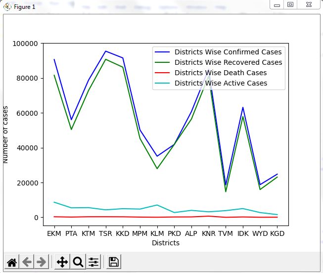
    elif YC == 5:
        plt.ylabel("Number of cases")
        plt.plot(District, Confirmed, color='b', label = "Districts Wise Confirmed Cases")
        plt.plot(District, Recovered, color='g', label = "Districts Wise Recovered Cases")
        plt.plot(District, Deaths, color='r', label = "Districts Wise Death Cases")
        plt.plot(District, Active, color='c', label = "Districts Wise Active Cases")
        plt.legend()
        plt.show()
    else:
        print("Enter valid input")


#FOR BAR GRAPH:)

def bar_plot():
    df = pd.read_csv('Covid_data_kerala.csv')
    df['Districts'] = ['EKM','PTA','KTM','TSR','KKD','MPM','KLM','PKD','ALP','KNR','TVM','IDK','WYD','KGD']
    District = df["Districts"]
    Confirmed = df["Confirmed"]
    Recovered = df["Recovered"]
    Deaths = df["Deaths"]
    Active = df["Active"]
    plt.xlabel("Districts")


    YC = int(input("Enter the number representing your preferred bar graph from the above choices:"))

    if YC == 1:
        plt.ylabel("Confirmed Cases")
        plt.title("Districts Wise Confirmed Cases")
        plt.bar(District, Confirmed, color='b', width = 0.5)
        plt.show()
    elif YC == 2:
        plt.ylabel("Recovered Cases")
        plt.title("Districts Wise Recovered Cases")
        plt.bar(District, Recovered, color='g', width = 0.5)
        plt.show()
    elif YC == 3:
        plt.ylabel("Death Cases")
        plt.title("Districts Wise Death Cases")
        plt.bar(District, Deaths, color='r', width = 0.5)
        plt.show()
    elif YC == 4:
        plt.ylabel("Active Cases")
        plt.title("Districts Wise Active Cases")
        plt.bar(District, Active, color='c', width = 0.5)
        plt.show()
    elif YC == 5:
        plt.bar(District, Confirmed, color='b', width = 0.5, label = "Districts Wise Confirmed Cases")
        plt.bar(District, Recovered, color='g', width = 0.5, label = "Districts Wise Recovered Cases")
        plt.bar(District, Deaths, color='r', width = 0.5, label = "Districts Wise Death Cases")
        plt.bar(District, Active, color='c',width = 0.5, label = "Districts Wise Active Cases")
        plt.legend()
        plt.show()
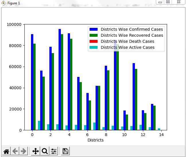
    elif YC == 6:
        D=np.arange(len(District))
        width=0.25
        plt.bar(D,Confirmed, width, color='b', label = "Districts Wise Confirmed Cases")
        plt.bar(D+0.25, Recovered, width, color='g', label = "Districts Wise Recovered Cases")
        plt.bar(D+0.50, Deaths, width, color='r', label = "Districts Wise Death Cases")
        plt.bar(D+0.75, Active ,width, color='c', label = "Districts Wise Active Cases")
        plt.legend()
        plt.show()
    else:
        print("Enter valid input")

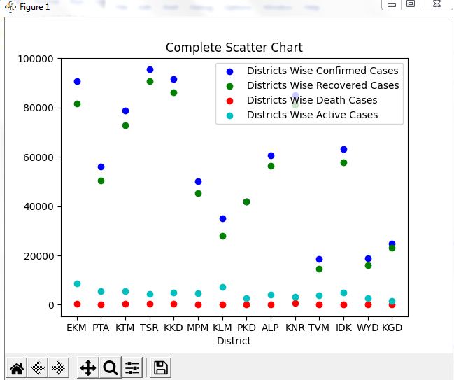
def scatter_chart():
    df=pd.read_csv('Covid_data_kerala.csv')
    df['Districts'] = ['EKM','PTA','KTM','TSR','KKD','MPM','KLM','PKD','ALP','KNR','TVM','IDK','WYD','KGD']
    District = df["Districts"]
    Confirmed = df["Confirmed"]
    Recovered = df["Recovered"]
    Deaths = df["Deaths"]
    Active = df["Active"]

    SC=plt.gca()
    SC=plt.scatter(District, Confirmed, color="b", label="Districts Wise Confirmed Cases")
    SC=plt.scatter(District, Recovered, color="g", label="Districts Wise Recovered Cases")
    SC=plt.scatter(District, Deaths, color="r", label="Districts Wise Death Cases")
    SC=plt.scatter(District, Active, color="c", label="Districts Wise Active Cases")

    plt.xlabel("District")
    plt.title("Complete Scatter Chart")
    plt.legend()
    plt.show()

Fun()
YC = int(input("Enter Your Choice: "))

while YC == 1 or 2 or 3 or 4 or 5 or 6:

    if YC == 1:
        Read_CSV()
        break
    elif YC == 2:
        No_Index()
        break
    elif YC == 3:
        line_plot()
        break
    elif YC == 4:
        bar_plot()
        break
    elif YC == 5:
        scatter_chart()
        break
    elif YC == 6:
        print("Thank You for using...")
        break
    else:
        print("Enter valid input")
        break
Sample CSV file for the above code:
Output:
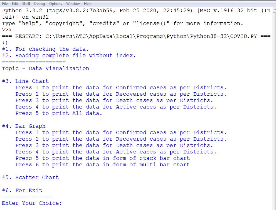
=== RESTART: C:\Users\ATC\AppData\Local\Programs\Python\Python38-32\COVID.PY
#1. For checking the data.
#2. Reading complete file without index.
===================
Topic - Data Visualization

#3. Line Chart
Press 1 to print the data for Confirmed cases as per Districts.
Press 2 to print the data for Recovered cases as per Districts.
Press 3 to print the data for Death cases as per Districts.
Press 4 to print the data for Active cases as per Districts.
Press 5 to print All data.

#4. Bar Graph
Press 1 to print the data for Confirmed cases as per Districts.
Press 2 to print the data for Recovered cases as per Districts.
Press 3 to print the data for Death cases as per Districts.
Press 4 to print the data for Active cases as per Districts.
Press 5 to print the data in form of stack bar chart
Press 6 to print the data in form of multi bar chart

#5. Scatter Chart

#6. For Exit
===============
Enter Your Choice:
Screenshot :
